In the previous article, I talked about the Wholesale Dataset from the UCI Machine Learning Repository. And then I implemented K-Means on the dataset in R. In this article, I will again use the same dataset including all the same pre-processing and then apply Hierarchical Clustering in R (hence, I will recommend you to read that article first if you haven’t already).
The main idea behind Hierarchical Clustering is that it creates a sequence of nested clusters based on the properties of the individual observations. There are two lines of thinking behind such algorithms -
- Agglomerative Clustering: This is a bottom-up approach to clustering, where each individual observation is a unique cluster. The algorithm then iteratively merges the most similar clusters into a new cluster. This is done until there remains just one cluster.
- Divisive Clustering: This is top-down clustering approach. In this, all of the observations are clustered into a single cluster. Then, each cluster is divided into two sub-clusters based on some form of similarity. This is done until each sub-cluster has just a single observation.
For this discussion, we will primarily focus on the first type - Agglomerative clustering.
Dendogram
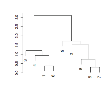
The analysis in hierarchical clustering is often done with the help of a Dendogram. As shown in Figure A.1.1 (from ISLR Chapter 10), a dendogram is a graphical representation of the hierarchy of clusters. Each node in the dendogram is a cluster and the lead nodes represent the individual observations or cluster with single observation. In agglomerative clustering, the lead nodes begin to merge into clusters or nodes, representing similar observations. As we move further up, all of the observations get clustered into a single node or the root of the tree.
 |
 |
|---|---|
| Figure A.1.1 | Figure A.1.2 |
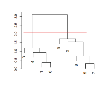
Dendograms also provide a very simple way to determine the number of clusters in the data. In order to determine the number of clusters all you have to do is to draw a horizontal line across the branches of the dendogram as shown in Figure A.1.2. Then, the number of clusters is then determined by the number of vertical lines on the dendogram below the drawn horizontal line - in this case, we get two clusters. Herein lies the biggest advantage of using dendograms is that the user does not need to have a superior knowledge about the number of clusters in the data. All the user has to do is to look at the dendogram and identify the level of granularity desired for the application and then decide the cut.
Comparison with K-Means
Given the two clustering algorithms we have seen, we can compare and contrast them. As already mentioned above, with Hierarchical Clustering we do not need superior knowledge about the data, hence determining the number of clusters is easy. However, K-Means has its own set of advantages - it uses less memory, it converges faster, being an iterative process it can recover from errors, and with different starting states, we can achieve possibly different results. In general, however, the idea is that K-Means is more suitable to numerical data, which Hierarchical Clustering is more suitable for Categorical Data.
Hierarchical Clustering in R
For Hierarchical Clustering, we will use the same scaled HoReCa dataset we used for K-Means. In order to implement Hierarchical Clustering we will use HCut from the factoextra package. The use of the method is quite simple. We just need to pass in our data and number of clusters we want. In this case, we pass in k = 3, but we will validate our assumption with the dendogram visualization. In order to do that, we will use fviz_dend from the same package.
# Hierarchical Clustering with no of clusters set to three
h_clust <- hcut(s_horeca_data, k = 3, hc_method = "ward.D")
# Dendogram visualization
fviz_dend(h_clust, rect = TRUE)
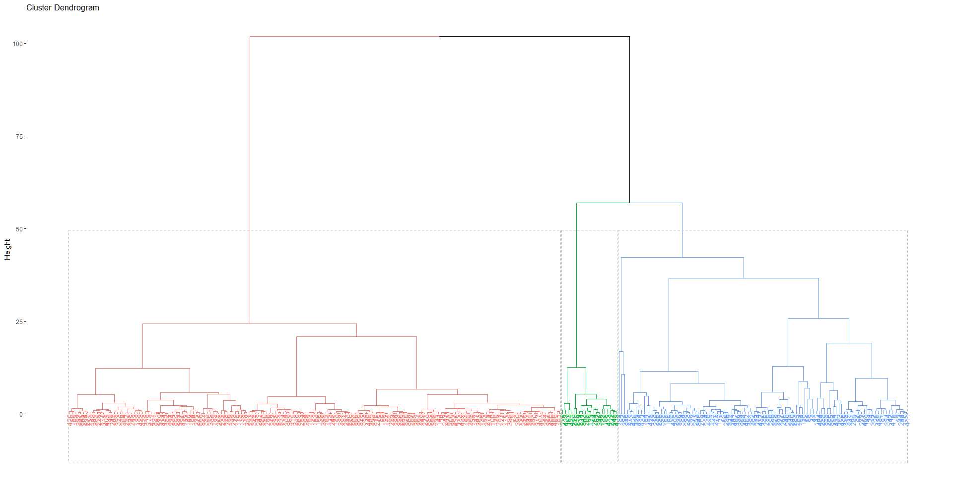
The dendogram for the clustering can be seen in Figure A.1.3. In this we can see that again one cluster includes a lot of observations in comparison to the other two similar to our results from K-Means.
 |
|---|
| Figure A.1.3 |
Visualization and Analysis
Now, we can visualize the clusters for Hierarchical Clustering. Once more, we will use the factoextra package for this.
# Visualization
fviz_cluster(h_clust, data = horeca_data,
          main = "Hierarchical Clustering Plot")
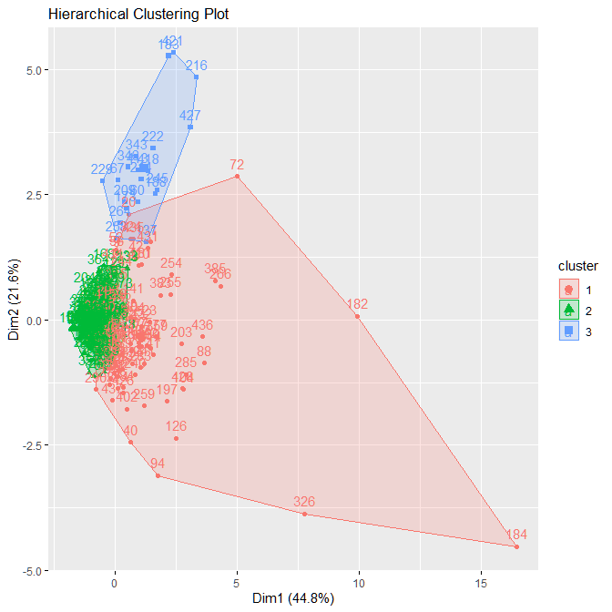
In the output in Figure A.1.4 we can see that results are not clear as they were for K-Means. The overlap seen in this image however, does not actually mean that the clusters intersect. It is important to remember that this is a 6-dimensional data that we are looking at in a 2-D plot. Given this, there is still no clear boundary between the red and green cluster.
 |
|---|
| Figure A.1.4 |
Comparative Analysis
Now, we can compare the results from K-Means and Hierarchical Clustering. For this purpose we will again use the Silhouette Width metric that we defined earlier. We will use the library(cluster) to calculate the Silhouette Score.
library(cluster)
# Silhouette Score
ss_k_means <- silhouette(km$cluster, dist(s_horeca_data))
score_k_means <- mean(ss_k_means[, 3])

# Silhouette Score
ss_hierarchical <- silhouette(h_clust$cluster, dist(s_horeca_data))
score_hierarchical <- mean(ss_hierarchical[, 3])
The results we get are score_k_means=0.49 and score_hierarchical=0.30. This shows that the clusters given by K-Means are a better representation of the data in comparison to Hierarchical Clustering.