In this article, we will look into K-Means Clustering and implement it in R. We will use the Wholesale Dataset from the UCI Machine Learning Repository to do this analysis.
Clustering and prediction algorithms are an important part of all industries, such as banking, manufacturing, healthcare, retail, etc. This kind of algorithms allows the stakeholders to analyze and figure out customers with similar characteristics and employ strategic campaigns.
In this article, we will use one such dataset - Wholesale Customers Dataset. This dataset consists of variables related to the annual spending in monetary units on diverse product categories like fresh products, milk, grocery, etc.
Dataset
In this section we will look at the dataset in a bit detail. In order to do that, we can load the dataset into our R program, remove the rows with NA’s and look at the details of the data.
# Read data and omit any rows with NA
data <- read.csv("Wholesale customers data.csv")
data <- na.omit(data)
head(data)
This gives us the following output -
  Channel Region Fresh Milk Grocery Frozen Detergents_Paper Delicassen
1       2      3 12669 9656    7561    214             2674       1338
2       2      3  7057 9810    9568   1762             3293       1776
3       2      3  6353 8808    7684   2405             3516       7844
4       1      3 13265 1196    4221   6404              507       1788
5       2      3 22615 5410    7198   3915             1777       5185
6       2      3  9413 8259    5126    666             1795       1451
We have six product categories - Fresh, Milk, Grocery, Frozen, Detergents_Paper and Delicassen. The measurements for these six columns are the annual spendings in monetary units (m.u.). Along with this, we have two other columns - Channel and Region. Channel can contain two values for Hotel, Restaurant, Cafe (HoReCa) and Retail channel. Region can hold three values for Lisnon, Oporto or Others.
We now do some further analysis on the data in order to evaluate whether it need further processing. The first thing we do it to see the frequency of the occurrence of each category for the column “Region”.
# Frequency of occurence of each category for the column "Region"
hist(data$Region, main = "Region Hisogram Plot")
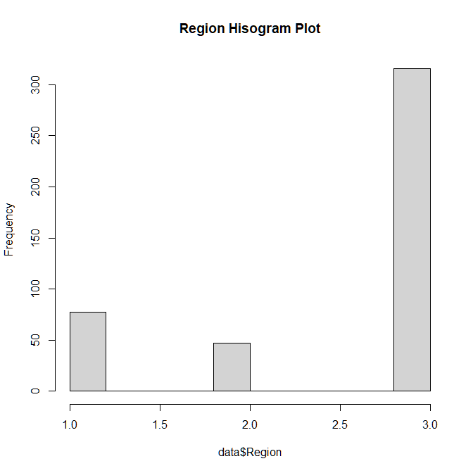
The output of the plot is as show in Figure A.1.1. In this we can see that the Region 3 which corresponds to “Others” is heavily overpowering the other two categories and hence it does provide much information to the data.
 |
|---|
| Figure A.1.1 |
Hence, we can simply remove this column from our data.
# Due to the presence of lots of "Others", we can simply drop this column
data <- subset(data, select = -c(Region))
head(data)
This gives us the following output -
  Channel  Fresh Milk Grocery Frozen Detergents_Paper Delicassen
1       2  12669 9656    7561    214             2674       1338
2       2   7057 9810    9568   1762             3293       1776
3       2   6353 8808    7684   2405             3516       7844
4       1  13265 1196    4221   6404              507       1788
5       2  22615 5410    7198   3915             1777       5185
6       2   9413 8259    5126    666             1795       1451
Now let’s look at the summary of our data and plot a box plot for the data as well-
# Lets look at the summary of the data
summary(data)
# Presence of some obvious outliers since Max >> Mean
boxplot(data)
The output of the summary is as follows -
Channel          Fresh             Milk          Grocery
Min.   :1.000   Min.   :     3   Min.   :   55   Min.   :    3
1st Qu.:1.000   1st Qu.:  3128   1st Qu.: 1533   1st Qu.: 2153
Median :1.000   Median :  8504   Median : 3627   Median : 4756
Mean   :1.323   Mean   : 12000   Mean   : 5796   Mean   : 7951
3rd Qu.:2.000   3rd Qu.: 16934   3rd Qu.: 7190   3rd Qu.:10656
Max.   :2.000   Max.   :112151   Max.   :73498   Max.   :92780
    Frozen        Detergents_Paper    Delicassen
Min.   :   25.0   Min.   :    3.0   Min.   :    3.0
1st Qu.:  742.2   1st Qu.:  256.8   1st Qu.:  408.2
Median : 1526.0   Median :  816.5   Median :  965.5
Mean   : 3071.9   Mean   : 2881.5   Mean   : 1524.9
3rd Qu.: 3554.2   3rd Qu.: 3922.0   3rd Qu.: 1820.2
Max.   :60869.0   Max.   :40827.0   Max.   :47943.0
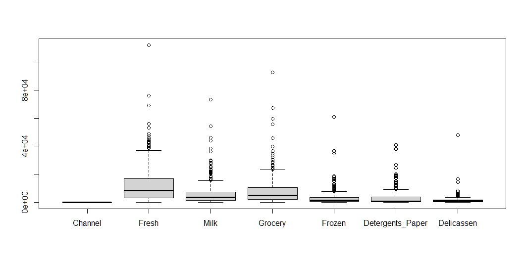
And the box plot for the same can be seen in Figure A.1.2.
 |
|---|
| Figure A.1.2 |
It is very clear from the boxplot, that there are some outliers for the numerical columns in the data. These outliers are the ‘Max Values’ in the summary. So, we can simply remove the rows that contain these specific values for each of the six numerical columns.
# Remove the outliers corresponding to the max values
data <- subset(data, Fresh != 112151 & Milk != 73498 & Grocery != 92780
                    & Frozen != 60869 & Delicassen != 47943)
K-Means Clustering
K-Means clustering is a data clustering technique which focuses on partitioning the data into many homogenous clusters. This means that observations, that are similar to one another but differ from other clusters, should be kept together.
The ‘K’ in K-Means refer to K such clusters. This is a value that is given by the user. There are computational methods in order to identify K for a given dataset, but at the end of the day, it comes down to domain knowledge about the particular dataset. The ‘Means’ in the name of this technique refers to the fact that each cluster has its own centroid, and the centroid is computed as the mean distance of observations in that cluster.
Given an initial set of k means the K-Means algorithm can be broken down into a two-step process -
- Assignment Step - Each observation is assigned to the cluster with the nearest mean. Being ‘near’ is defined as having the least squared Euclidean Distance.
- Update Step - Based on the assignment of the observations, the new set of means can be calculated.
We repeat the above two steps till convergence, i.e., the means do not change anymore.
Data Analysis
Now, lets implement K-Means on our Wholesale Customer Dataset. K-Means is an unsupervised algorithm. This means that we do not need the labels for our data; we just need to have an overall understanding of what our data represents. For this purpose, we will use a subset of our dataset that belongs to the Channel corresponding to the HoReCa.
# Get all rows with Channel 1
horeca_data <- subset(data, Channel == 1, select = -c(Channel))
We know that horeca_data consists of data from three sources - Hotel, Restaurants and Cafes. So, ideally, the number of clusters for our data should be three. We can verify this fact using Silhouette Width Analysis. Silhouette is a metric which can be used to determine how similar an observation is in comparison to its own and also to other clusters. This metric can range from -1 to +1 where the higher the score is, the better the clustering. We can use this metric to compare the cluster quality at various values of ‘k’. In order to do this we will use a package called “factoextra”. This library provides the visualization for the Silhouette Width vs number of Clusters given the data being clustered using K-Means.
# Import the package factoextra
library(factoextra)
# Find the number of clusters using Silhouette Width criteria
fviz_nbclust(horeca_data, kmeans, method = "silhouette")
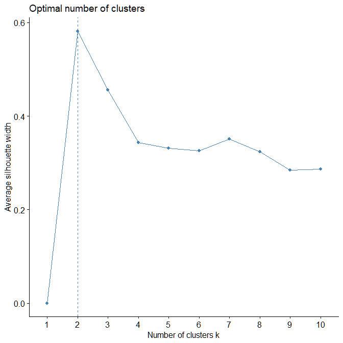
The result of this visualization can be seen in Figure A.2.1. As we can observe here, the maximum value of the Silhouette Width is achieved for k = 2 which indicates that the optimal number of clusters for this data should be 2 and not 3 like we initially hypothesized. However, there is a caveat to this plot. Currently, the different product categories have different range of values and, since we are calculating Euclidean Distance between observations, the magnitude of the value is playing a huge role compared to the relative positioning of the observations. Hence, it would be ideal to first scale the data and then do our analysis.
 |
 |
|---|---|
| Figure A.2.1 | Figure A.2.4 |
s_horeca_data <- scale(horeca_data)

# Boxplot
boxplot(horeca_data)
boxplot(s_horeca_data)
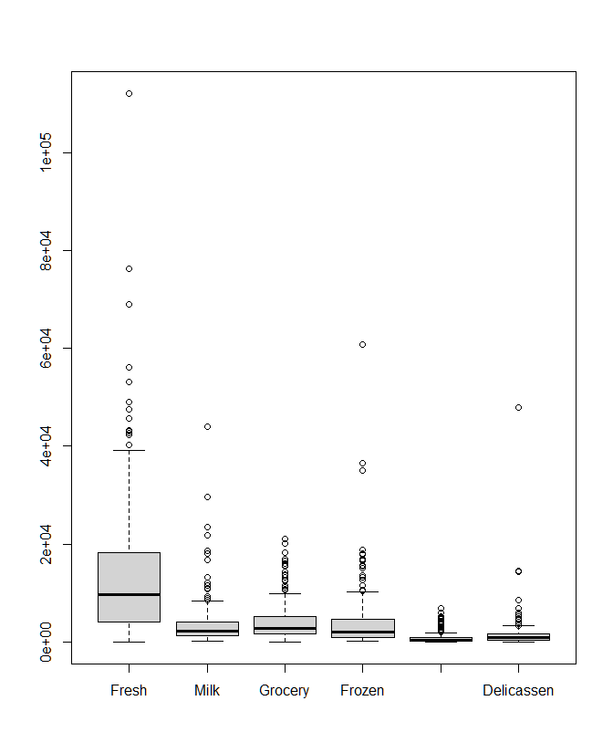
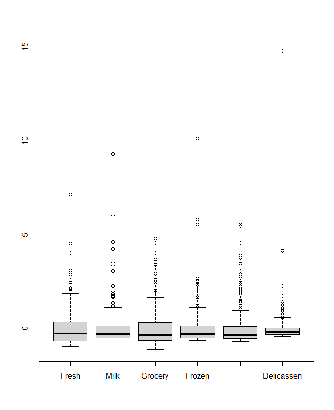
In the above code we first scale our data and then plot the boxplots for the original and scaled data. In the boxplot for the scaled data (Fig A.2.3), we can see that the values are now normalized and comparable to each other in contrast to the boxplot of original values (Fig A.2.2) which are not.
 |
 |
|---|---|
| Figure A.2.2 | Figure A.2.3 |
Now we can run our Silhouette Analysis again -
fviz_nbclust(s_horeca_data, kmeans, method = "silhouette") +
geom_vline(xintercept = 3, linetype = 2)
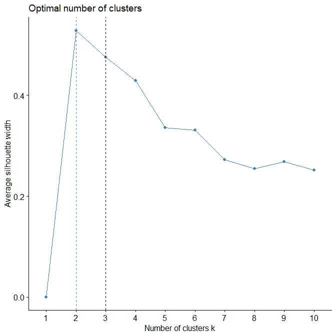
Again, in Figure A.2.4, we see that the optimal number of clusters are still 2, but the Silhouette Width for k = 3 has increased from before and is now comparable to one for k = 2. This is a good example of using domain knowledge to guide us into a better estimate of the number of clusters. The reason for k = 2 being a better setting, might be due to an imbalance in the dataset. However, that does not change the fact that our data still comes from three categories - Hotels, Restaurants and Cafes. Thus, we can apply K-Means with k = 3.
K-Means in R
To apply K-Means, we will simply use the kmeans method in R. For this, we simply need to provide our dataset, the number of centers or k, and the maximum number of iterations.
# Kmeans with 3 clusters
km <- kmeans(s_horeca_data, centers = 3, iter.max = 1000)
We can look at the various parameters of the clustering including the centers, the size of the clusters etc.
# KMeans centers
km$centers

# Cluster sizes
km$size
> km$centers
Fresh Milk Grocery Frozen Detergents_Paper Delicassen
1 -0.06148558 -0.1969952 -0.3085586 -0.1028763 -0.2913875 -0.1257023
2 1.97290334 2.5333669 2.0188911 2.6834788 0.1830949 1.9744612
3 -0.37894629 0.4429893 1.5466342 -0.3638713 2.2145728 0.1260791
> km$size
[1] 252 14 32In the cluster size, we can see that the predicted clusters are quite imbalanced which verifies our initial hypotheses about the data.
Visualization and Analysis
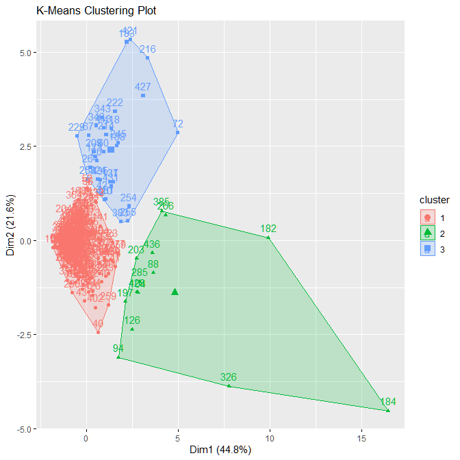
Now, we can look at the visualization of these clusters. Again we will use the factoextra package for this. We are dealing 6-dimensional data and visualizing that is impossible. For this reason, the plot being used automatically calculates the two principal components and visualizes the clusters along those components.
# Visualization
fviz_cluster(km, data = s_horeca_data,
            main = "K-Means Clustering Plot")
The output as seen in Figure A.2.5 shows that the clusters are quite well separated. The red cluster is the most densely populated and, hence, contains the highest number of observations i.e., 252. The other two clusters are localized to some degree, but they stretch to reach the outliers as well.
 |
|---|
| Figure A.2.5 |
This concludes this blog about using K-Means in R. In the next blog I will talk about using other clustering techniques.